Theming
The modal has three layers of styling:
- A theme: light, dark or auto, plus an accent color, a radius scale and a font.
- An appearance: fine control over colors per mode, radii per part, fonts, the title and your logo.
- A locale and messages: the language, and every string in the modal.
All three are plain objects. Pass them to OpenRampProvider, OpenRampEmbedded, openDeposit(), or set them as properties on <openramp-modal>.
Themes
import { lightTheme, darkTheme, autoTheme } from '@openrampkit/web' // or '@openrampkit/react'

lightTheme()
darkTheme({ accent: '#6E8BFF' })
autoTheme({ accent: '#12805C', radius: 'medium', fontFamily: 'Inter, sans-serif' })
autoTheme follows the user's system setting (prefers-color-scheme) and updates live when it changes.
| Option | Type | Default | Description |
|---|---|---|---|
accent | string | #2744C4 (light), #6E8BFF (dark) | Buttons, focus ring, selected rows |
accentText | string | Computed | Text on the accent color. For hex accents, black or white is picked by contrast. |
radius | 'none' | 'small' | 'medium' | 'large' | 'large' | Corner radius scale |
fontFamily | string | System UI stack | Body font |
colors | Partial<ThemeColors> | Overrides for any color. With autoTheme they apply to both modes. |
When accent is a hex color, the theme also derives accentSoft (a transparent tint) and focus. The focus ring uses the accent only when it has at least 3:1 contrast with the card background. Otherwise it keeps the default ring, so keyboard focus stays visible. Text on soft accent backgrounds (selected chips, badges) uses the text color, so any accent keeps text readable.
The radius scales are:
| Scale | card | row | button | input |
|---|---|---|---|---|
none | 0px | 0px | 0px | 0px |
small | 12px | 8px | 8px | 8px |
medium | 16px | 12px | 12px | 12px |
large | 20px | 14px | 14px | 14px |
Server components
@openrampkit/web/theme exports the theme functions without Lit. Import from there (or from @openrampkit/react) in code that runs on the server.
ThemeColors
accent, accentText, accentSoft, background, surface, surfaceHover, border, text, textSecondary, textMuted, success, successSoft, danger, dangerSoft, warning, warningSoft, overlay, focus, shadow.
The defaults are exported as lightColors and darkColors from @openrampkit/web.
Appearance
const appearance = {
  colors: {
    light: { background: '#FFFDF8', surface: '#F6F1E7' },
    dark: { background: '#101114' },
  },
  radius: { button: '999px' },
  fontFamily: 'Inter, sans-serif',
  fontFamilyMono: 'JetBrains Mono, monospace',
  borderWidth: '1px',
  title: 'Top up',
  merchantName: 'Acme',
  logoUrl: 'https://acme.example/logo.svg',
  hideFooter: true,
}| Field | Description |
|---|---|
colors.light, colors.dark | Color overrides for one mode. Applied after the theme. |
radius | card, row, button, input: any CSS length |
fontFamily, fontFamilyMono | Body and monospace fonts. fontFamily wins over the theme's. |
borderWidth | Default 1px |
title | Header title on the first screen. Default "Deposit". |
merchantName | Alt text for the logo |
logoUrl | Logo in the header on the loading and methods screens |
hideFooter | Hide "Powered by OpenRampKit" |
The order of precedence is: base colors for the mode, then theme accent, then theme colors, then appearance.colors[mode].
CSS variables
The element turns the theme and appearance into CSS custom properties and sets them as inline styles on the host element:
| Variable | From |
|---|---|
--ork-color-* | Every ThemeColors key in kebab case, for example --ork-color-text-secondary |
--ork-shadow-card | colors.shadow |
--ork-radius-card, --ork-radius-row, --ork-radius-button, --ork-radius-input | Radius scale and appearance.radius |
--ork-font-family, --ork-font-mono | Fonts |
--ork-border-width | appearance.borderWidth |
Because they are inline styles, a stylesheet rule on openramp-modal does not override them unless it uses !important. Prefer theme and appearance. The element also sets data-mode="light" or data-mode="dark" on itself.
Parts
The Shadow DOM exposes these parts for layout tweaks: overlay, card, header, body, footer.
openramp-modal::part(card) {
  max-width: 440px;
}
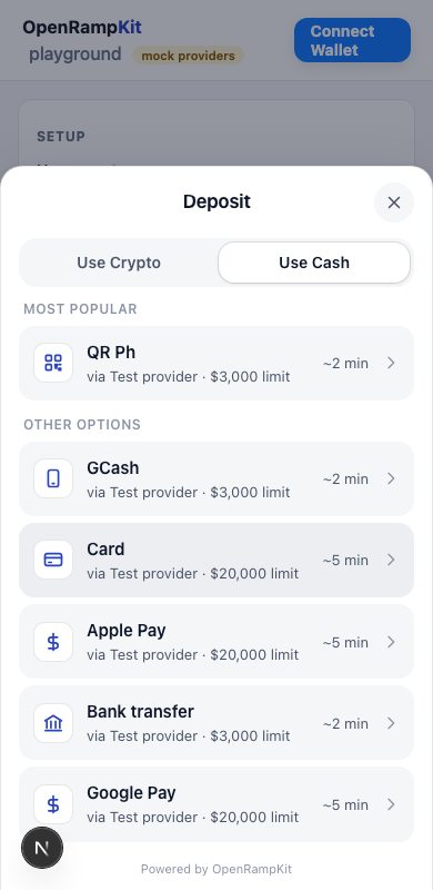
On screens narrower than 480px, the modal (not embedded) shows as a bottom sheet.
Languages
The modal has built-in catalogs for English (en), Vietnamese (vi), Indonesian (id), Thai (th), Malay (ms) and Filipino (fil). The aliases tl, in and zsm map to fil, id and ms.
The locale is picked in this order:
- The explicit
localeoption (openDeposit,OpenRampProvider,OpenRampEmbedded, or the element'slocaleproperty or attribute). - The session locale, when your backend passed
localetosessions.create(). - English. The modal does not follow the browser language, so it stays in English unless your app asks for another language.
Only the language subtag counts for the catalog (vi-VN uses vi). An explicit locale without a built-in catalog (for example fr) still sets the number and currency format, and its strings fall back to English, so pair it with messages.
<OpenRampProvider baseUrl="/api/openramp" locale="th">Messages
Pass a partial messages object to change copy. It overrides the chosen catalog key by key:
import { defaultMessages } from '@openrampkit/web'

const messages = {
  title: 'Top up',
  continueTo: (provider: string) => `Pay with ${provider}`,
  // Nested records are replaced, not merged: spread the defaults.
  stepTitle: { ...defaultMessages.stepTitle, PAYMENT: 'Pay now' },
}
Some keys are functions (via, limit, etaMinutes, continueTo, and others), and stepTitle, legStatus and failedTitle are records. defaultMessages is the English catalog; catalogs has all of them. See packages/web/src/i18n/en.ts for every key.
Helpers exported from @openrampkit/web: resolveLocale({ locale, sessionLocale }), resolveMessages({ ...sources, messages }), catalogFor(tag), and mergeMessages(overrides) (a shallow merge over English only).
React
<OpenRampProvider baseUrl="/api/openramp" theme={darkTheme({ accent })} appearance={appearance} messages={messages}>The provider pushes theme, appearance and locale changes to an open modal right away. messages apply the next time the modal opens.